Adaptive Icons

I'm a software engineer with a huge passion in mobile development. I co-organize the Google Developer Group Guatemala and Kotlin User Group Guatemala communities.
I love to share with tech communities and I have been to a couple of events as a speaker, like Kotlin Everywhere Guatemala, JConf Guatemala, JConf México, SGVirtual Conference, Android 11 Meetup Latam, Latin Android Summit.
Adaptive icons are definitely not a new thing in the Android world. They were introduced in Android 8.0 (Oreo), around four years ago. Not so many things have changed since then, but I think it will be good if we do a quick review on the topic.
Legacy Icons
Let's talk about how icons were implemented in versions prior to Oreo, which we will call legacy icons from now on. Legacy icons are easy to implement. You need to have at least one PNG for each different density from mdpi to xxhdpi (four in total), but ideally, you should also add one for the xxxhdpi. The icon's size needs to be 48x48 dp and it can have any transparency. This opens the opportunity to have icons with different types of shapes. It means your icon can be a circle, square, or any shape really.
 Source: androidauthority.com
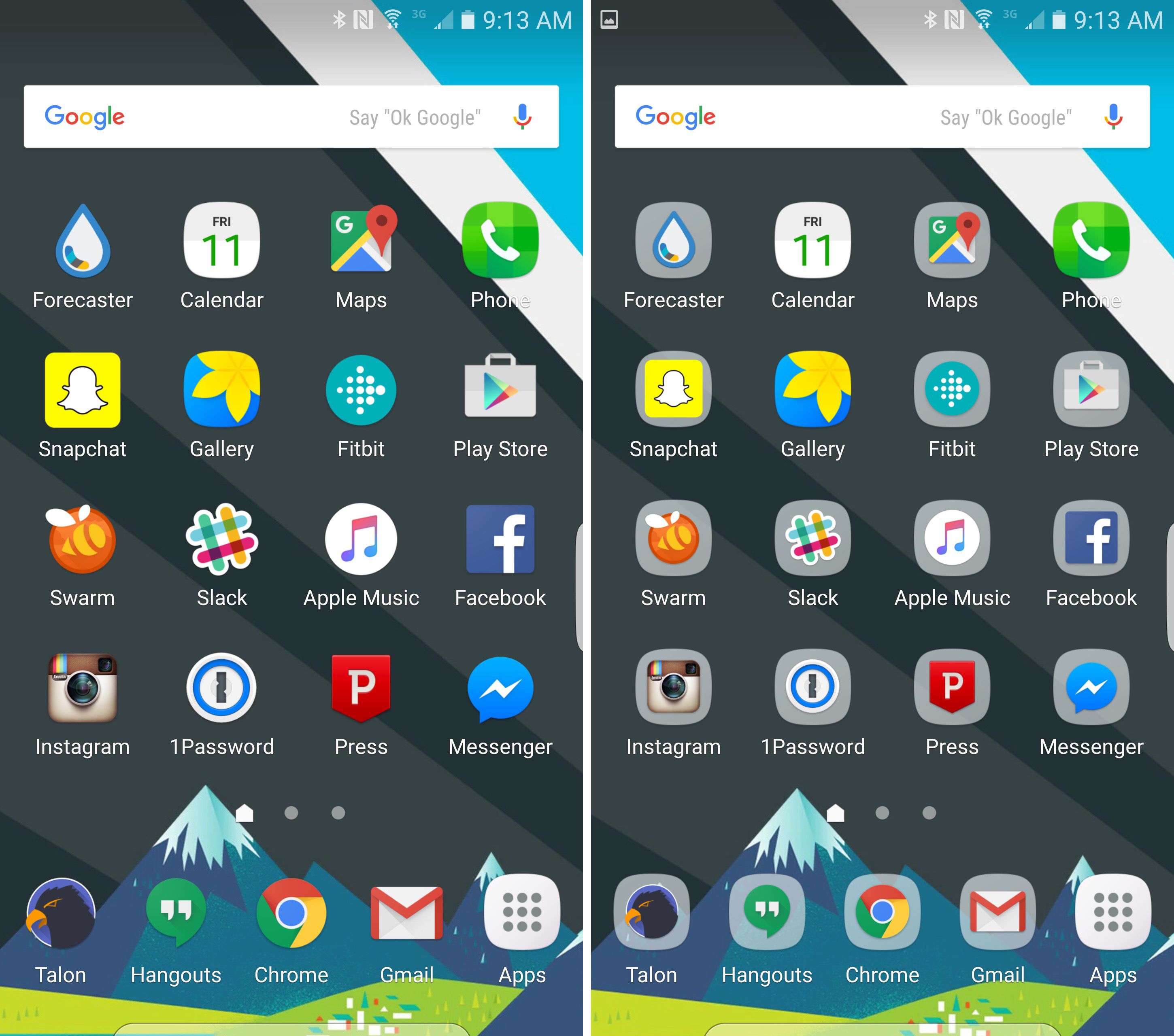
Initially having a unique shape was a good practice because it meant your app icon was more likely going to stand out compared to other apps. But this resulted in a Launcher full of icons with different shapes and sizes and a lot of inconsistency.
Normalizing icon shapes and sizes
This started a new movement in trying to normalize the icon shapes and sizes in the Android Platform. Samsung was the first OEM that introduced a background behind the icons that make them look more consistent.
 Left: Standard icon look. Right: Icons with backgrounds. Source: cnet.com
The second attempt at trying to introduce a more consistent icon experience was in Android 7.1 (Nougat) with the introduction of the roundIcon. This new feature had some restrictions, especially with OEMs looking to differentiate their devices by having different icon shapes (ie: Pixel devices use circular icons, Samsung a rounded square shape, and other OEMs might use a rectangular shape). This was solved in Android 8.0 with the introduction of Adaptive Icons.
So… Adaptive Icons
An Adaptive Icon is made up of two layers, foreground, and background, both of 108x108 dp. Ideally, these two layers should be vector assets, but they can also be PNGs. The downside of using PNGs is that you will need to provide at least 4 different PNGs per density (mdpi to xxhdpi) for each layer (8 PNGs in total). With vector assets, you will only need two files which will save you a lot of space.
Basically, Android will apply a mask to both layers and clip an area around your icon. Different OEMs will apply different shapes of masks. You need to have in mind that because of the applied mask you will need to put your icon in a safe area that is around 33dp from the center of the icon.
 Adaptive icons support a variety of masks which vary from one device to another. Source: developer.android.com
How to create an Adaptive Icon?
If you are a developer (with no design skills like myself) the short answer is to use the Asset Studio from Android Studio. Using Asset Studio is very easy, you can import both of your layers and the Asset Studio will generate the files for you.
If your app supports Android < 8.0 you can set up Asset Studio to also generate both the legacy icon and the round icon.
The Asset Studio will show you the safe zone and a really nice preview of how different masks will be applied to your icon. You can resize both of the layers if needed. The background layer can be just a color drawable, but as I mentioned before you can also provide a vector asset, which means the background can be really anything, for example, you can have a gradient as the background layer.
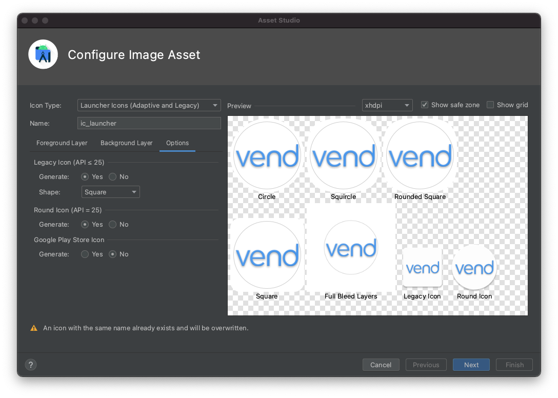
When creating the Adaptive Icon, Asset Studio will generate for you several files. It will add the two layers as drawables, for example, if you used vector assets for your layers it will generate a drawable/ic_launcher_foreground.xml for your foreground layer and a drawable/ic_launcher_background.xml for your background layer.
The Adaptive Icon file by default will be called ic_launcher.xml. If your app's minimum SDK is 26 or higher this file can live in the mipmap resource directory, but if not (most of the apps), it will be stored in the mipmap-anydpi-v26 resource directory. This is because Adaptive Icons are only supported on API level 26 or higher, and on versions below 26, you will need to have the legacy icon saved in the mipmap-mdpi, mipmap-hdpi, etc.
For example, if your minimum SDK is 23 you could end up with this file tree in your res directory:
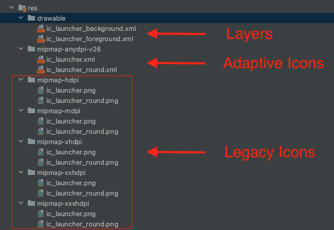
If the
ic_launcher_roundadaptive icon is the same one as the normalic_launcher, instead of duplicating the file you can provide a resource alias in yourvalues-anydpi-v26folder.<resources> <mipmap name="ic_launcher_round">@mipmap/ic_launcher</mipmap> </resources>
Now you only need to specify the icon file in your app's AndroidManifest.xml like you would normally do.
    <application
        android:icon="@mipmap/ic_launcher"
        android:roundIcon="@mipmap/ic_launcher_round"
        ...
And this is how the Adaptive Icon looks internally. It is pretty simple, you only need to use the adaptive-icon tag, and inside add both layers using the background and foreground tags (Asset Studio does this for you).
<adaptive-icon xmlns:android="http://schemas.android.com/apk/res/android">
    <background android:drawable="@drawable/ic_launcher_background"/>
    <foreground android:drawable="@drawable/ic_launcher_foreground"/>
</adaptive-icon>
For designers 🧑🎨
If you are a designer and like to use fancy design tools, you can also use these tools to design Adaptive Icons.
- Sketch Template by Nick Butcher
- Adobe Illustrator Template by Nick Butcher
- Adobe XD Template by Faiz Malkani
- Bjango Templates by bjango
More Adaptive Icon stuff...
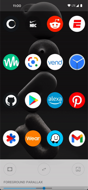
The real reason for having two layers is because it allows OEMs to do really cool animations when a user interacts with your icon, like moving the foreground layer on top of the background layer.
 Adaptive icons support a variety of visual effects. Source: developer.android.com
But, how can we test the animated visual effects of our Adaptive Icons on a real device? Well, thanks to Nick Butcher again, we can use his Adaptive Icon Playground app to see how the animated visual effects perform in the icon. You can download the APK from the repo, run the app and you will be able to see the Adaptive Icons of all of your installed apps on your device.
Wrapping up
Implementing Adaptive Icons is a great way to make your app follow the best practices and be in tune with the other apps on the devices of our users. Remember that App Icons are a great investment because they usually are the first thing the user sees, and that also involves seeing the animated visual effects in the latest Android versions or supporting different Icon shapes in different OEMs.
Resources
Special thanks to Chris Weathers, Camilo and Mauricio for reviewing this.
UPDATES
July 28, 2022: The final beta release of Android 13 has been published which includes the support for adding themed app icons.